


Tru Fru:
Homepage Audit

Dear Rachel and Trü Frü team,
I really enjoyed our conversation last time. One thing that stood out to me was your mention of Trü Frü’s plans to strengthen its e-commerce presence and create a more consistent brand experience. Out of genuine interest, I took a quick look at the current homepage and put together a short UX/UI audit. I thought it might be helpful as the team continues those discussions.
My goal was simply to explore how a few small refinements could help enhance the user experience, better reflect the brand’s personality online, and prepare Trü Frü for its future growth in e-commerce.
The Trü Frü website delivers a bright, friendly, and premium experience. Its pastel color palette, appetizing photography, and modern typography communicate freshness and indulgence. However, several UX and UI details could be refined to improve legibility, navigation clarity, and conversion, particularly across mobile devices. This audit focuses solely on the homepage, outlining key opportunities and practical recommendations to enhance the user experience, maintain consistency, and strengthen the brand’s visual storytelling.

Overall Impression
1/ STRENGTHS
Color Palette: Pastel tones reinforce freshness and playfulness, fitting the brand’s approachable indulgence.
Photography: High-quality lifestyle imagery makes the product feel craveable and premium.
Typography: The serif/sans-serif combination feels friendly and modern, echoing Trü Frü’s dual focus on fresh and fun.
2/ AREAS OF IMPROVEMENT
A few elements, for example CTAs, text legibility, and mobile responsiveness, could be optimized to reduce friction and maintain brand coherence.
Detailed Findings
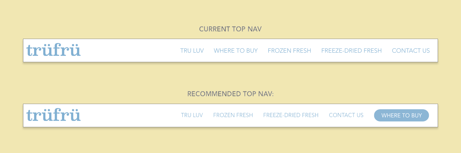
1/ TOP NAV
Problem:
Thin sans-serif text in blue on a semi-transparent white background reduces legibility, especially on desktop.
“Where To Buy” lacks prominence as a key conversion driver.
Recommendation:
Increase font weight or contrast for readability.
Elevate “Where To Buy” into a distinct button to guide user action and boost conversions.
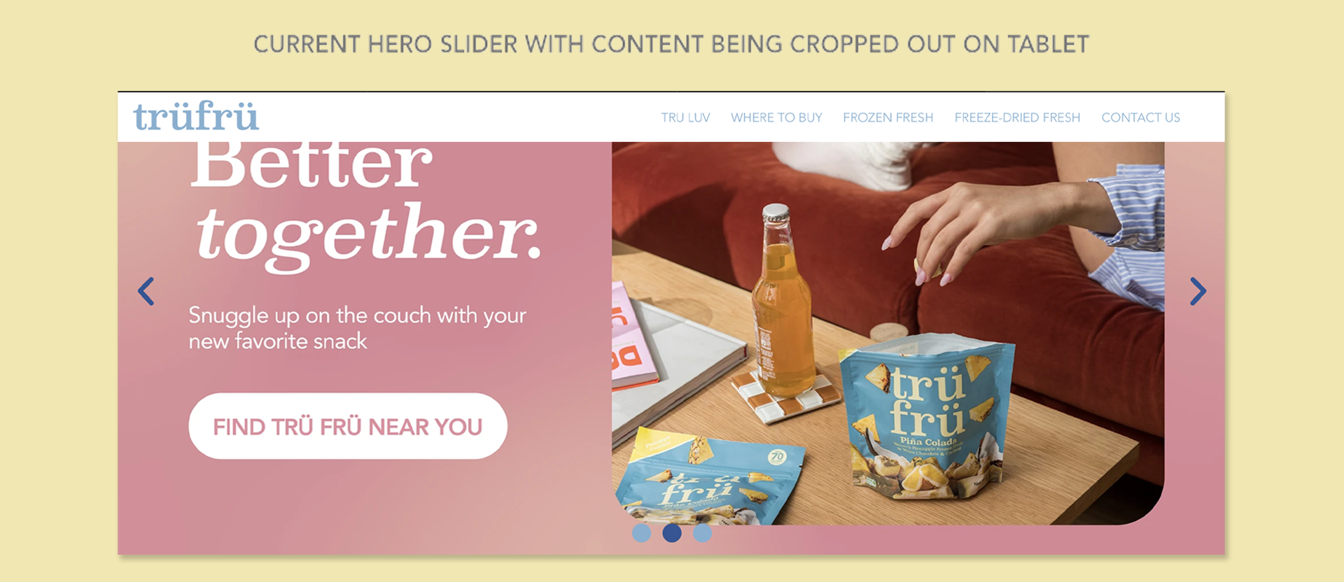
2/ HERO SLIDER
Problem:
Combining headlines, buttons, and imagery into single image files harms SEO rankings and risks important content being cropped, especially on mobile devices.
“Shop Now” CTA is misleading since the site does not offer direct sales.
The first slide’s all-sans-serif type feels slightly off-brand.
Recommendation:
Separate design elements from background images to maintain responsive integrity, SEO friendly, and improve user experience.
Use “Find Trü Frü Near You” as the primary CTA.
Maintain the subtle gradient treatment from the second slide for depth and cohesion.
Third slide is a good informational piece, consider making the third slide its own section for clarity.
3/ “INDULGE WITH MOTHER NATURE” SECTION
Strengths:
Strong visuals effectively communicate the difference between Frozen Fresh and Freeze-Dried Fresh.
Fun graphic elements add interest to the section.
Opportunities:
Sync surrounding text and arrow colors with the selected product mode (white vs. cream) for visual reinforcement.
Adjust image and text scaling for better mobile visibility.
Align typography styling (“Mother Nature” in serif) to maintain brand consistency.
4/ PRODUCT GRID
Problem:
Hover effects don’t translate well to mobile.
Lack of a clear CTA creates a confused customer journey
Reviews stats of some products appear to be low or incomplete.
Background transitions feel abrupt between product groups.
Recommendation:
Replace star ratings with a clear “Learn More” button and add a “Where To Buy” link below each product.
Use a soft gradient from white to cream to add depth and improve visual flow.
Consider simplifying hover behavior to a tap-friendly alternative on mobile.

5/ CUSTOMER LOVE (REVIEW SECTION)
Problem:
Three-column static layout with only three reviews feels cherry-picked and limits engagement.
Recommendation:
Convert to a slider or carousel with 6–8 reviews.
Introduce filtering between “All Reviews” and “Product-Specific Reviews” to build credibility.
6/ FOLLOW US ON INSTAGRAM SECTION
Strength:
Excellent inclusion of authentic, social proof-driven content.
Opportunities:
Increase image sizes and expand grid to full width to emphasize visuals and energy of the brand.

7/ TRÜ FRÜ NEAR YOU SECTION
Strength:
The animated delivery van is a delightful, brand-appropriate touch, fun yet unobtrusive.
Recommendation:
Maintain this level of subtle motion as a standard for future micro-interactions.
Replace the rectangular button with a pill-shaped one to ensure consistency and maintain a friendly look and feel.
8/ BOTTOM SOCIAL CONTENTS SECTION
Problem:
Redundant with earlier Instagram blade; content overlap confuses hierarchy.
Recommendation:
Consider merging both sections, using the more authentic UGC-driven version for better emotional resonance.
9/ FOOTER
Problem:
“Buy Now” label is misleading since no direct sales occur.
Several links are broken.
Recommendation:
Replace “Buy Now” with “Find Trü Frü.”
Relocate “Recipes” to the Top Nav to highlight content value and SEO potential.
Audit all footer links for accuracy and consistency.

Action Plan
While the brand’s personality is well established, several design and usability adjustments can yield immediate improvements in clarity, conversion, and consistency.
PRIMARY FOCUS AREAS
Clarity: Improve legibility, refine CTAs, and remove misleading or repetitive navigation cues.
Consistency: Align typography hierarchy, CTA wording, and color logic across all blades.
Conversion: Prioritize strong “Where To Buy” and “Find Near You” CTAs to guide user flow.
Responsiveness: Ensure all imagery, type, and interactions scale effectively on mobile.
Engagement: Redesign social and review sections to feel more authentic and dynamic.
QUICK WINS
These changes can be implemented rapidly with minimal development effort but will have a visible impact on usability and perception:
Increase navigation contrast and adjust font weight for improved legibility.
Update CTA labels to be action-oriented and accurate (“Find Near You” instead of “Shop Now”).
Adjust image scaling and cropping in the hero section to prevent cut-off visuals on mobile.
Standardize typography styles (use serif for key headers like “Mother Nature” for brand consistency).
Add a clear “Learn More” + “Where to Buy” button combo on product cards.
Replace broken footer links and clarify “Buy Now” to align with the site’s non-e-commerce model.
NEXT STEPS
Prioritize high-impact fixes first (CTA labeling, top navigation contrast, and mobile optimization).
Implement quick wins across the homepage, then test their effect on engagement and conversion.
Explore incremental design refinements for the review and social sections as phase two.
Schedule a follow-up usability review once updates are live to measure improvements and guide further optimization.
Conclusion
WHY ARE THESE UPDATES THE RIGHT FIRST STEP TO ELEVATE TRÜ FRÜ’S BRAND PRESENCE AND PERFORMANCE IN E-COMMERCE?
Trü Frü’s website already captures a bright and inviting personality. The colors, photography, and tone all reflect the brand’s fresh and premium nature. A few design and usability refinements could make the experience even stronger. Improving legibility, aligning call-to-action language, and keeping typography and color use consistent would help the site feel more unified and reliable. These updates would allow the online experience to match the same quality and confidence that people already associate with the brand in stores.
By clarifying the user journey and guiding visitors with clear calls to action such as “Learn More” and “Where To Buy,” Trü Frü can make it easier for people to explore and engage with the brand. Small adjustments to navigation, product presentation, and mobile scaling can make the experience feel more natural and enjoyable. These refinements help build trust, encourage repeat engagement, and lead to better conversion outcomes.
Looking ahead, this is an opportunity to create a foundation for long-term consistency across all channels. A clear and cohesive digital system will make it easier to launch new campaigns, introduce products, and maintain a recognizable identity everywhere the brand appears. With these thoughtful updates, Trü Frü can strengthen its presence online while keeping its freshness and friendly spirit at the heart of every interaction.
Thank you for your time!
—
Prepared by Nam Tran for Trü Frü