

CozyCube Brand Identity
When homeownership costs more than your firstborn and a kidney, it’s time for fresh ideas. A tiny home company set out to challenge the real estate and home improvement status quo with equal parts ingenuity, inventiveness, and can-do-itiveness in a not-so-tiny way.
I took the wheel on transforming that vision into a brand worth rooting for, collaborating on the name, shaping the brand’s voice and tone, and directing a visual identity that hits hard across every platform. From color palettes and typography to a website and social content that actually feel cohesive, I led the charge in making CozyCube’s big ideas look just as bold and disruptive as they sound.
This was where I stepped in.
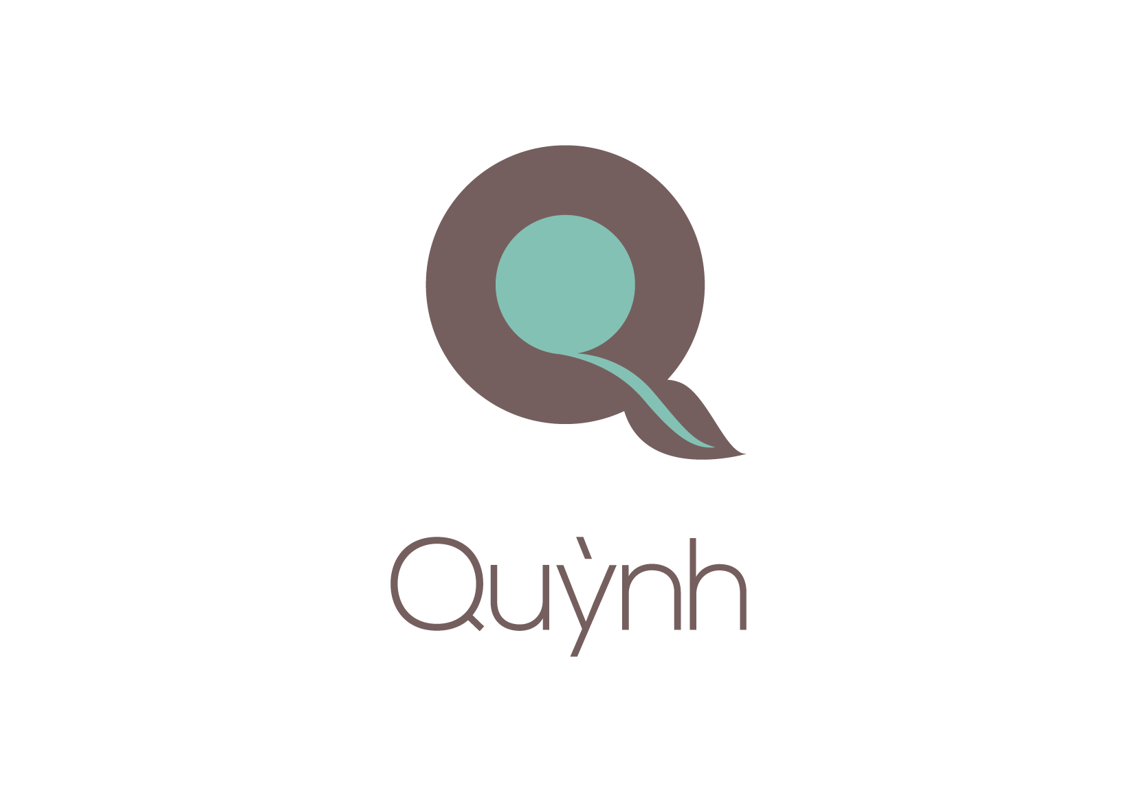
The CozyCube logo wasn’t cooked up with compasses, rulers, or the sacred golden ratio. Math has its place, but this brand is not about cold precision. It is about being approachable, human, and just a little imperfect in the best way. The square inside the C is not meant to impress geometry teachers, it is meant to feel like a cozy core surrounded by support. Because at the end of the day, homes and the people who live in them are not defined by flawless angles. They are defined by comfort, character, and connection. That is why this mark leans human instead of mathematical, aligning with CozyCube’s values of ingenuity, attainability, and choice.
The visual language we landed on is soft, contemporary, and down to earth. We chose earthy greens and browns to reflect her connection to nature and paired them with Nexa, a clean, modern, and versatile typeface that works across everything from signage to invoices. I also created a custom leaf pattern to add texture and depth to stationery, wrapping, and packaging—just enough rhythm to keep things feeling fresh without overwhelming the simplicity of the system.

Honestly, it turned out a lot more polished than you'd expect from a project powered by friendship, sarcasm, street food, and mutual guilt trips.
-
— Brand Identity
— Art Direction
— Graphic Design
— Environmental
— Print Design -
Art Director
— Nam TranGraphic Designer
— Nam TranCopywriter
— Nam TranCreative Director
— Nam Tran
— Quynh Le