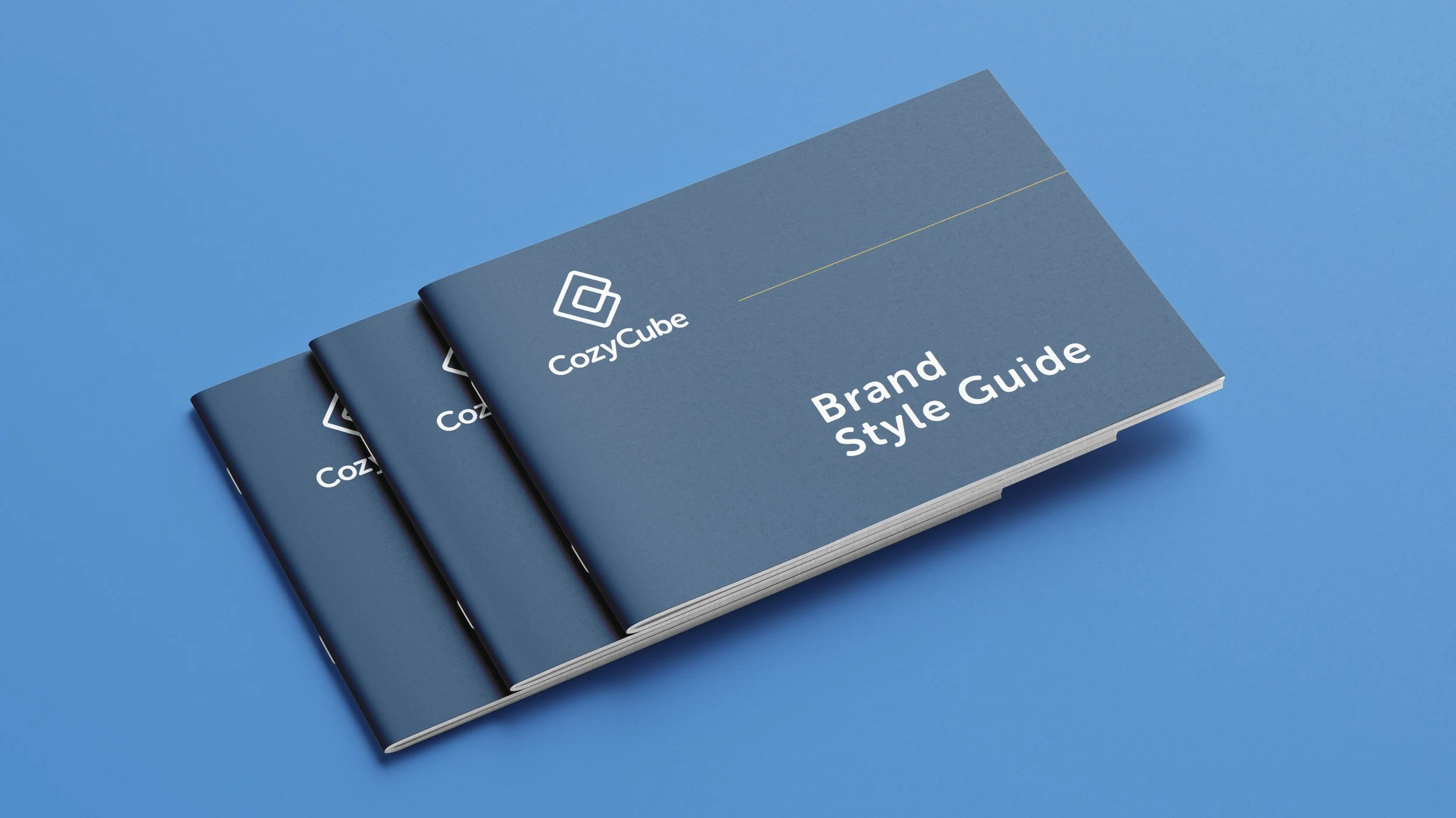
CozyCube Brand Identity
When homeownership costs more than your firstborn and a kidney, it’s time for fresh ideas. A tiny home company set out to challenge the real estate and home improvement status quo with equal parts ingenuity, inventiveness, and can-do-itiveness in a not-so-tiny way.
I took the wheel on transforming that vision into a brand worth rooting for, collaborating on the name, shaping the brand’s voice and tone, and directing a visual identity that hits hard across every platform. From color palettes and typography to a website and social content that actually feel cohesive, I led the charge in making CozyCube’s big ideas look just as bold and disruptive as they sound.

Crafting the Perfectly Imperfect Mark
The CozyCube logo wasn’t cooked up with compasses, rulers, or the sacred golden ratio. Math has its place, but this brand is not about cold precision. It is about being approachable, human, and just a little imperfect in the best way. The square inside the C is not meant to impress geometry teachers, it is meant to feel like a cozy core surrounded by support. Because at the end of the day, homes and the people who live in them are not defined by flawless angles. They are defined by comfort, character, and connection. That is why this mark leans human instead of mathematical, aligning with CozyCube’s values of ingenuity, attainability, and choice.
—
N.Tran the Account Manager: The TL;DR is though both our Art Director and Lead Designer are Asian, they're terrible at Math. So they have to cover their behind on this project some how, lol.
Scrolls Well With Others
Launching a brand is one thing, but making it scroll-worthy is another. We carried CozyCube’s new identity into the social sphere, building a presence that played nice with the feed while still stopping thumbs in their tracks. Playful visuals paired with clear, approachable messaging made sure CozyCube showed up in a way that was memorable, shareable, and unmistakably theirs. Through this early stage of the campaign, we tested, tried, and learned which visual elements and tones of voice sparked the most engagement, and why.
Since We’re Talking About Scroll-Worthy, How About Scroll-Immersive
The CozyCube site transforms movement into experience, with images expanding to fill the viewport as you scroll, pulling visitors right inside. A custom cursor adds playfulness by glowing, enlarging, and even showing action text to keep navigation engaging. Midway through, a vertically scroll-controlled gallery takes over, showcasing featured products in a way that keeps attention locked in. And to make the journey simpler, we helped streamline the sales process into three easy steps, each paired with a fun animation that makes it as enjoyable as it is effortless.
-
— Brand Identity
— Art Direction
— Web Design
— Social Content
— Illustration -
Art Director
— Nam TranGraphic Designer
— Sam Perrins
— Nam TranAnimator
— Sam PerrinsDeveloper
— Ryan GroomCopywriter
— Joel Pino
— Nam TranCreative Director
— Jeff Martin

